


Mt6 — DECA: Jason Cawood's Top 10 Magazines
REGINA | DECA is our series inviting artists to curate top ten lists

WORDS BY JENNIFER BROWNE
PHOTOGRAPHY BY JASON CAWOOD
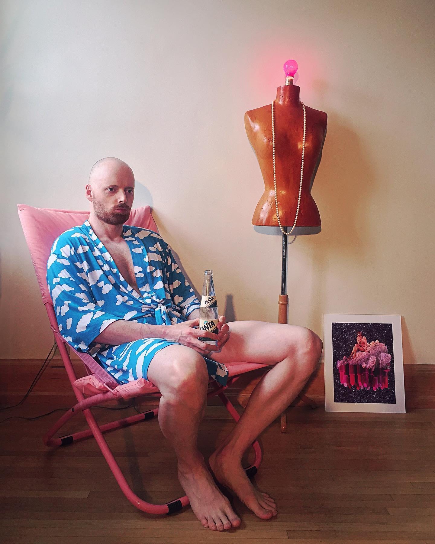
As one-half of the collaborative vision behind Phomohobes — alongside media artist Colby Richardson — Jason Cawood has spent over a decade infusing his creative drive into a project that defies traditional constraints.
Assembled from a vast collection of archived images, mostly from Cawood’s magazine collection, these works occupy a liminal space that transcends the boundaries of conventional collage. The chronological distance between their original and repurposed usage allows these images to be perceived as quotations, as mere “ideas of images” detached from their initial contexts. Beyond Phomohobes, Cawood’s explorations led him to the Popular Sizes project on Tumblr─a natural evolution born out of his same urge to give new life to the magazine clippings cluttering his apartment. Peeling away the layers of these two projects to return back to their source material, Cawood joins Cannopy Magazine’s DECA series for a look at the top 10 magazines from his vast collection.
LONG-TERM COLLABORATION
CAN | As Phomohobes enters its second decade as an ongoing collaborative project, what do you find you appreciate the most looking back at the last ten years of a project into which you can always infuse your creative drive?
JC ─ Looking back, I really appreciate the way we established a pretty focused visual signature right out of the gate. We quickly settled upon an almost comically strict set of guidelines for how the collages should come together, with “rules” about what was and what wasn’t considered acceptable content for a collage: which decades we drew from, what sources were off limits, and the amount or balance of elements that was either too much or not enough. This is very satisfying for me because I can now place a collage from 2012 beside one from last year, and they can both exist in the same universe as a singular body of work with no obvious indication that one is early and the other is current. We’re big on building a coherent Phomohobes world.
POPULAR SIZES
CAN | How has the co-evolution of yours and Colby’s vision on the project influenced your Popular Sizes project on Tumblr?
JC ─ As for Phomohobes influencing Popular Sizes, I think it’s more so the other way around. One of the reasons Colby and I began making things together was, after years of pillaging magazines for content to scan for Tumblr, I inevitably ended up with stacks of clippings and cut-outs that were cluttering up my apartment. So it just made sense to give them another life as art. I’ve often had to make decisions with images we find, like “should this be kept intact for Popular Sizes or sliced to bits for Phomohobes”?
TOP 10 MAGAZINES
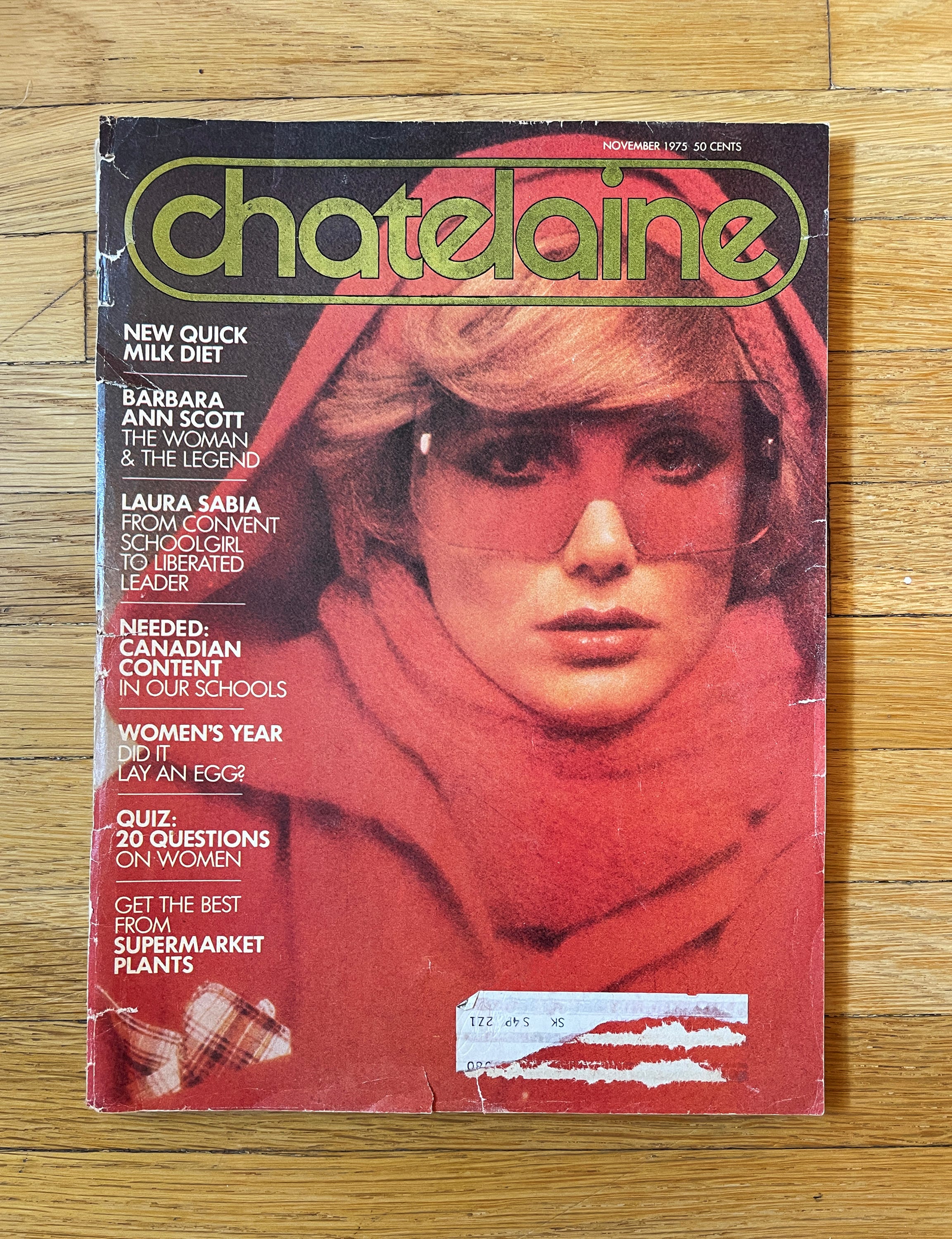
1) Chatelaine ─ In the 1980s, if you were a second-wave feminist working-Canadian mom who loved to accessorize (or just a weird little introverted gay kid fascinated with adult things), Chatelaine was required reading. Phomohobes has actually gotten a ton of collage elements from Chatelaine─in terms of most-used sources it’s right up there with Good Housekeeping and Torso (the gay porn mag).
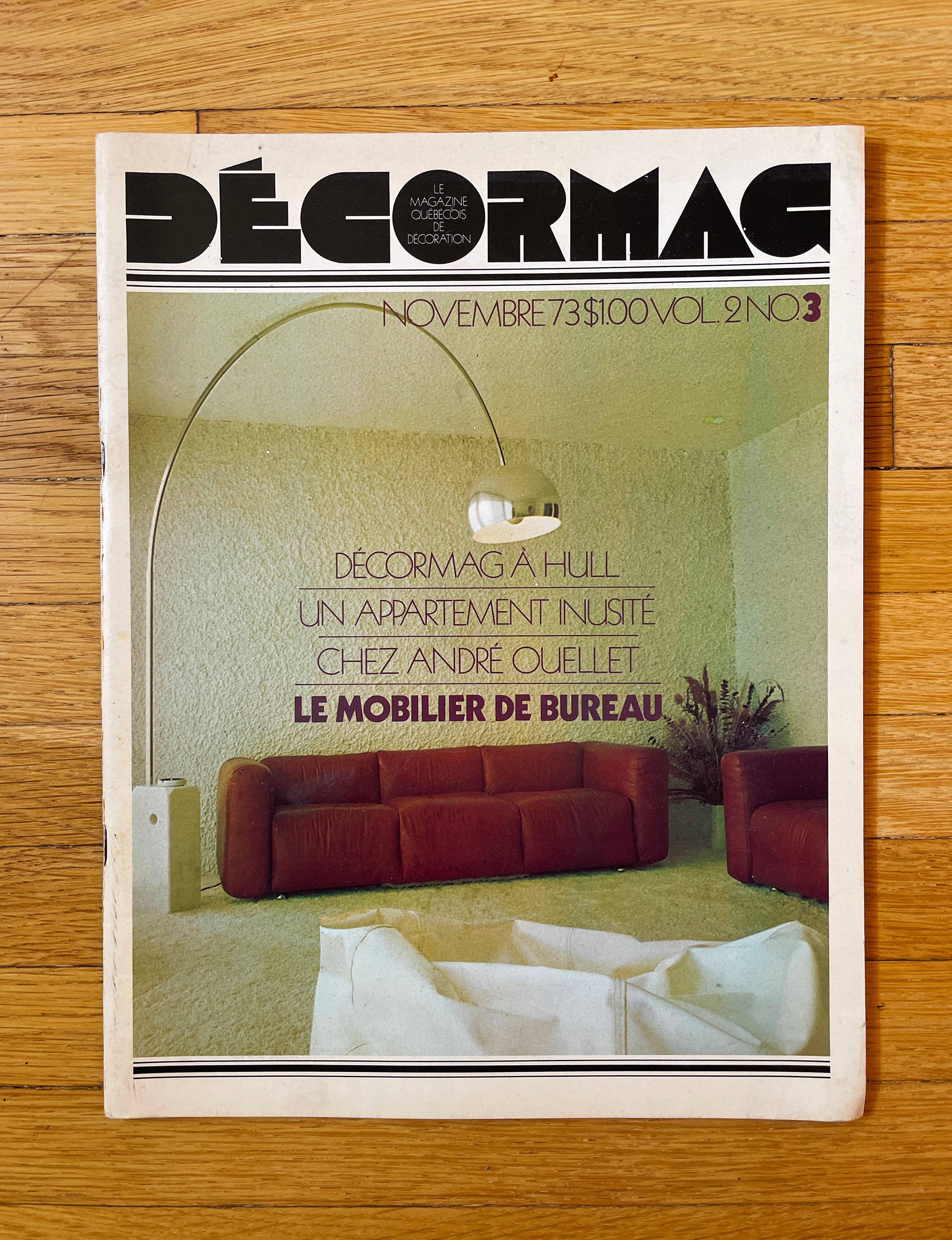
2) Décormag ─ A Québécois publication that began in 1972 and ran until 2015 I think. The hard-to-find 70s issues are a real goldmine of the sickest vintage Canadiana interiors, the kind that were so bold and progressive and yet also soft and cozy, that future generations would be forever jealous of and/or baffled by.
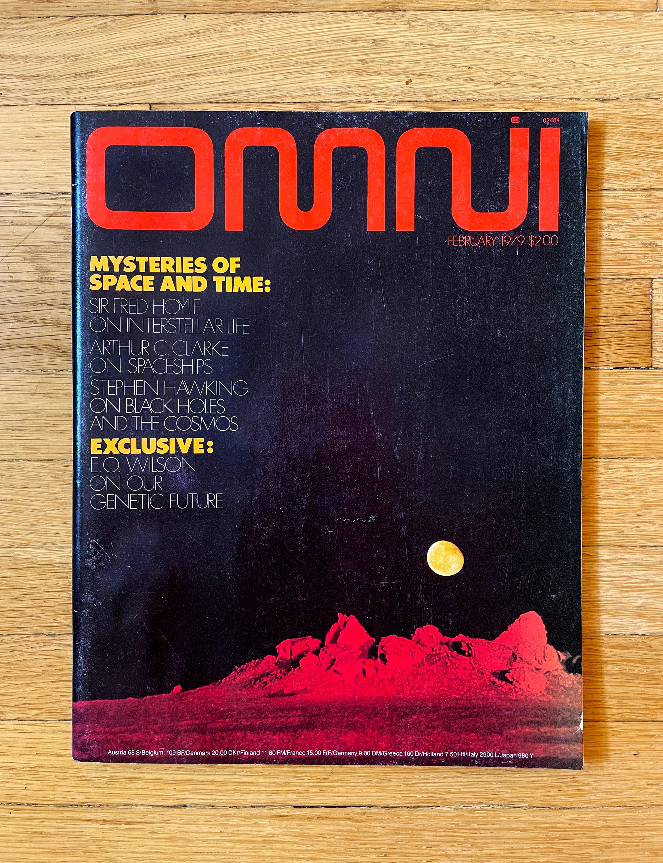
3) Omni ─ We really lost something as a society when science stopped being illustrated with slick, sexy airbrushed graphics.
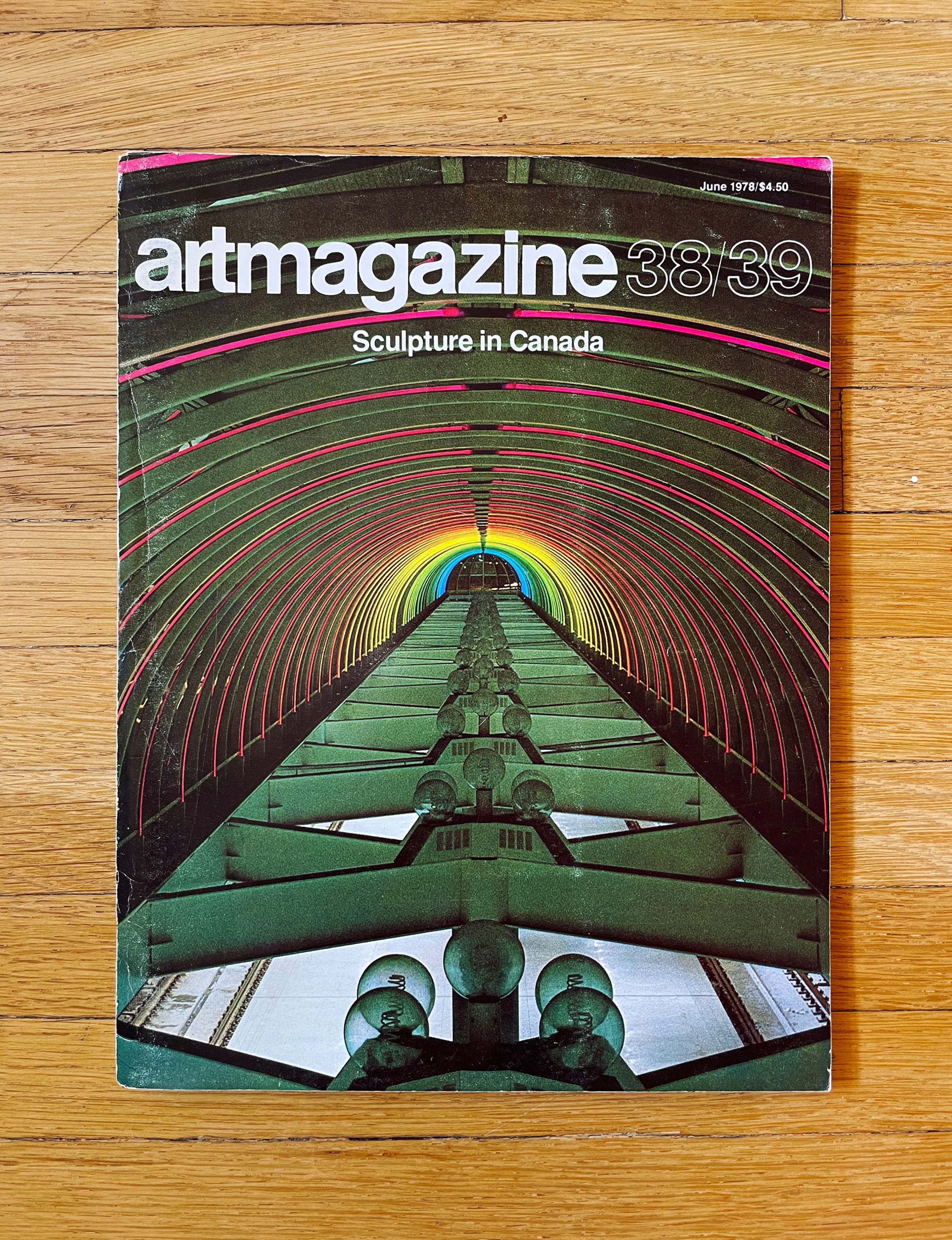
4) artmagazine ─ This and artscanada were what merged to become Canadian Art in the early 80s. Before that, they were both very streamlined publications with a strict, minimalist design aesthetic, as evidenced by the Helvetica all lowercase typeface. People like to think that the 70s were 100% tacky, but actually so much of it was this variety of tidy, understated modernism.
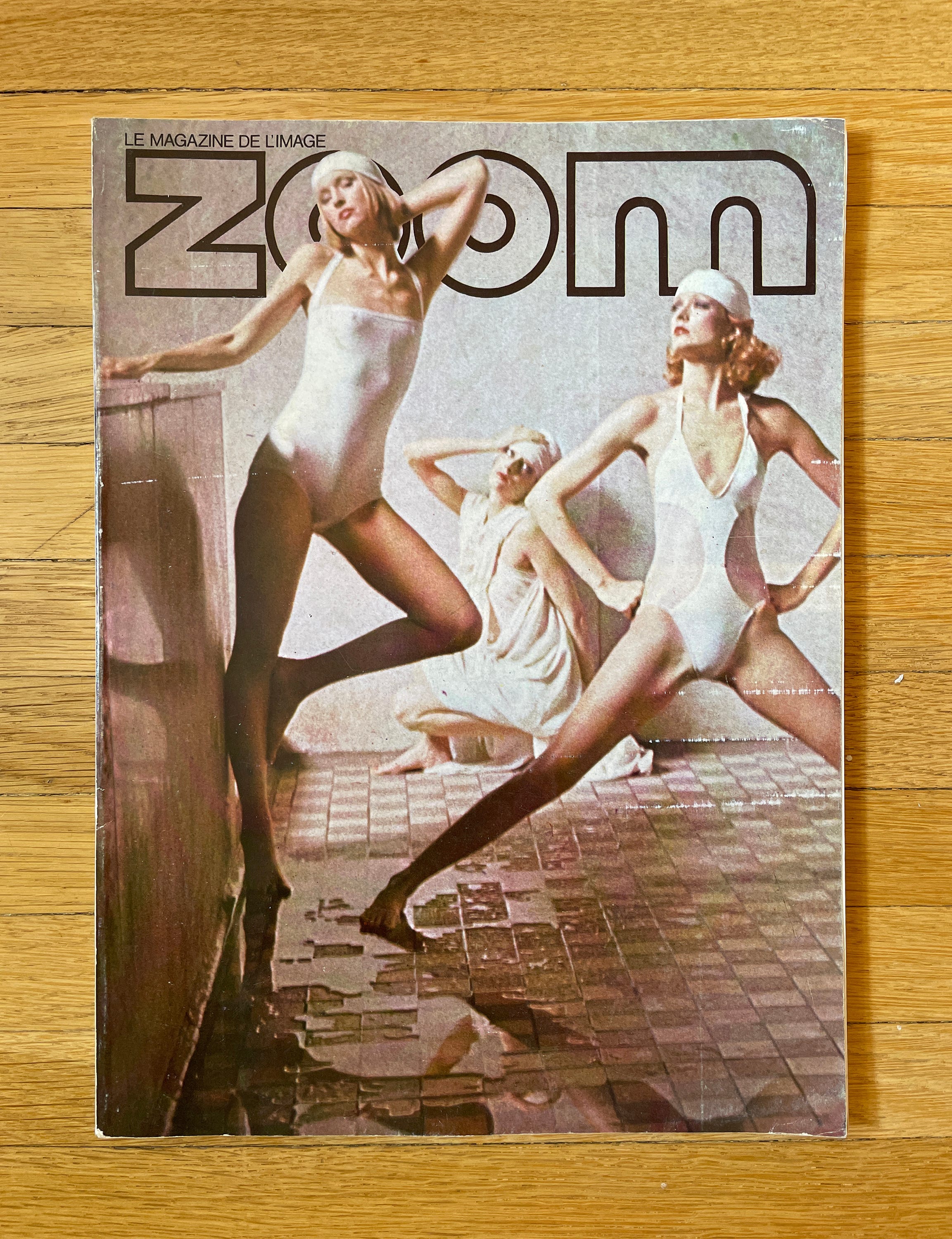
5) Zoom ─ A venerable Italian photography magazine that used its fine-art status to add a tasteful sheen over what was essentially softcore porn for straight guys who wanted a socially acceptable way to look at naked ladies. To be fair, that was the agenda of many photography publications of the 70s, but Zoom’s production value and cutting-edge style made it the best of the bunch.
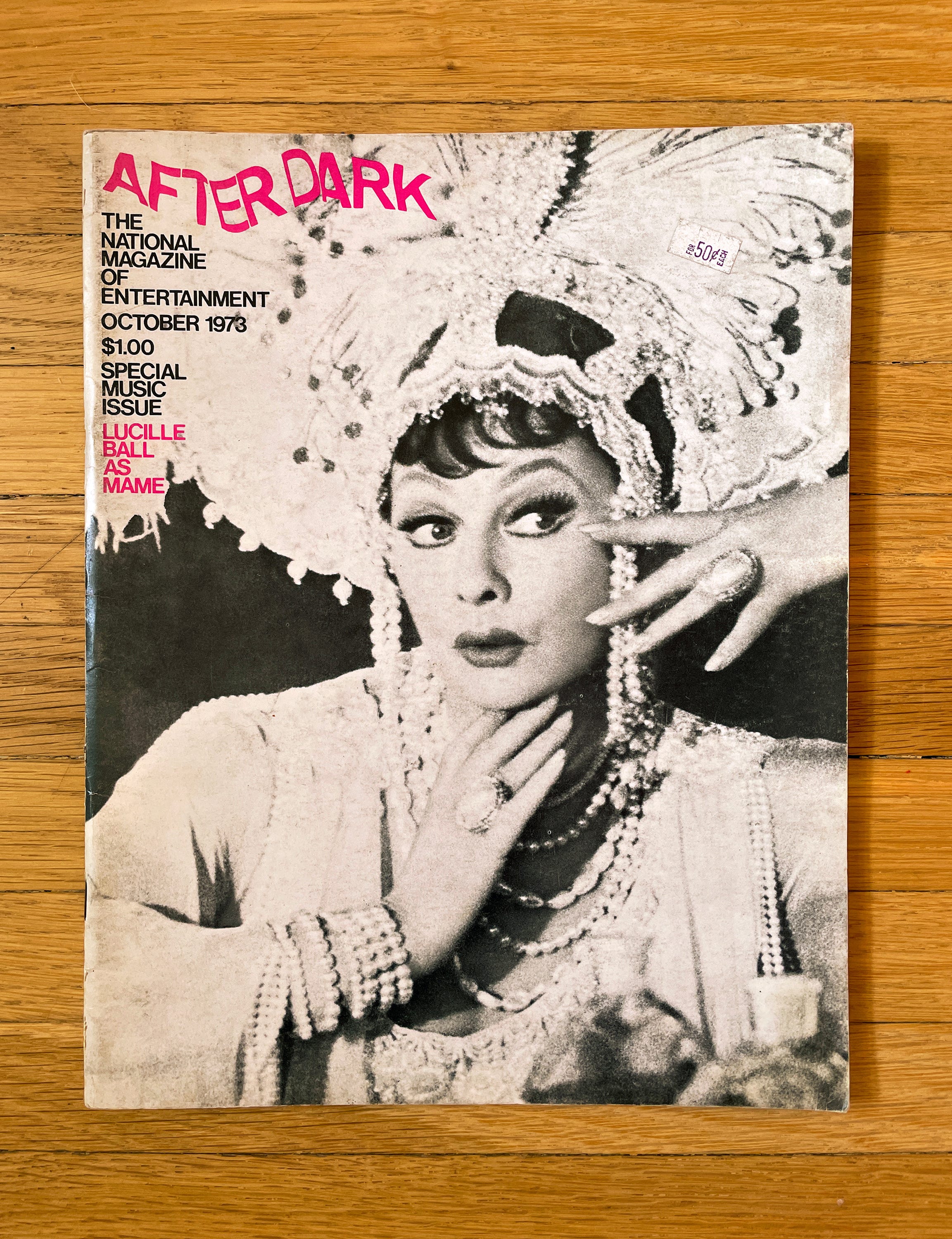
6) After Dark ─ An entertainment magazine that made use of the same loophole as Zoom, but for gays, in that it was heavily coded as gay-interest without actually coming out and declaring it outright. That meant that there were naked dudes inside, but often with a woman sandwiched between them as a buffer to confuse the morality police.
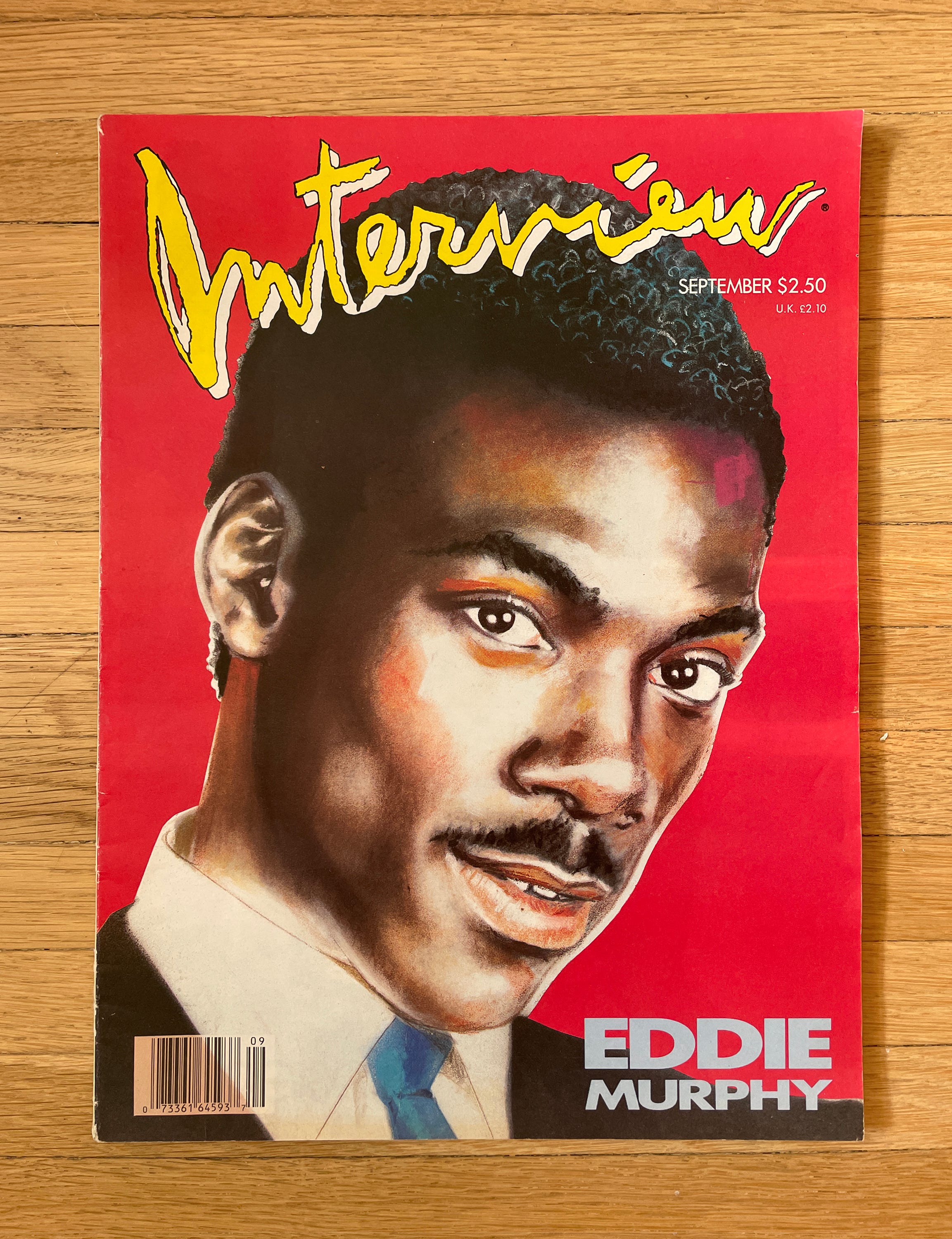
7) Interview ─ It’s hard to tell because there’s nothing else for scale in my photo, but Interview magazines used to be HUGE. And if you go further back in history (the issue in the photo is from 1987), they were even bigger. As was the style, the magazine shrunk down to more modest proportions in the 90s (Premiere did this too), which is a shame because their covers really were works of art.
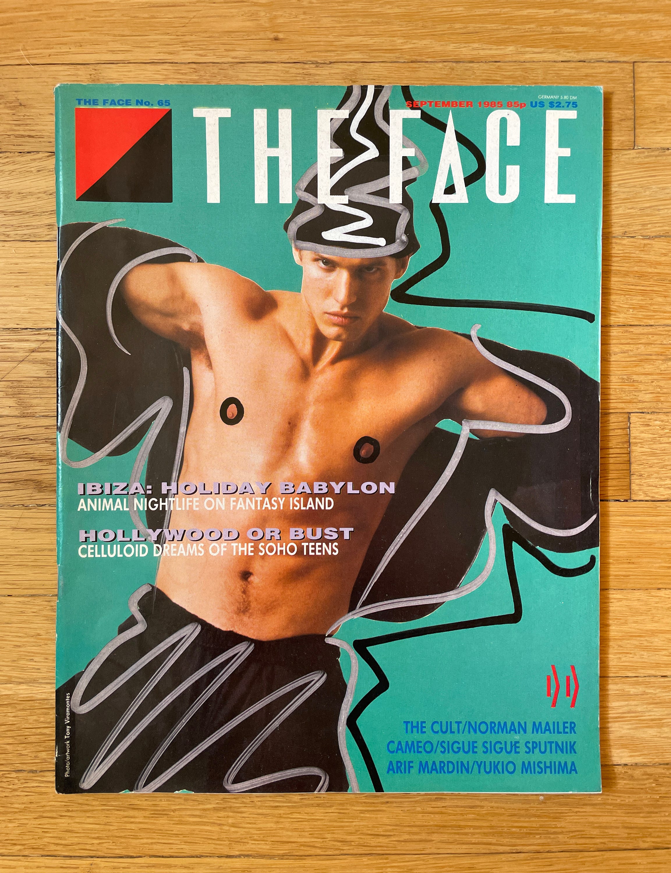
8) The Face ─ Probably the best magazine of all time. I used to buy The Face in that period of the mid 90s just before the internet became a thing, and my only connection to the outside world was through magazines and television. I had this pretentious urge to like cool things and rise above my lowly Regina upbringings, and in this regard anything from the UK would do, especially if it came packaged in a postmodern design sensibility.
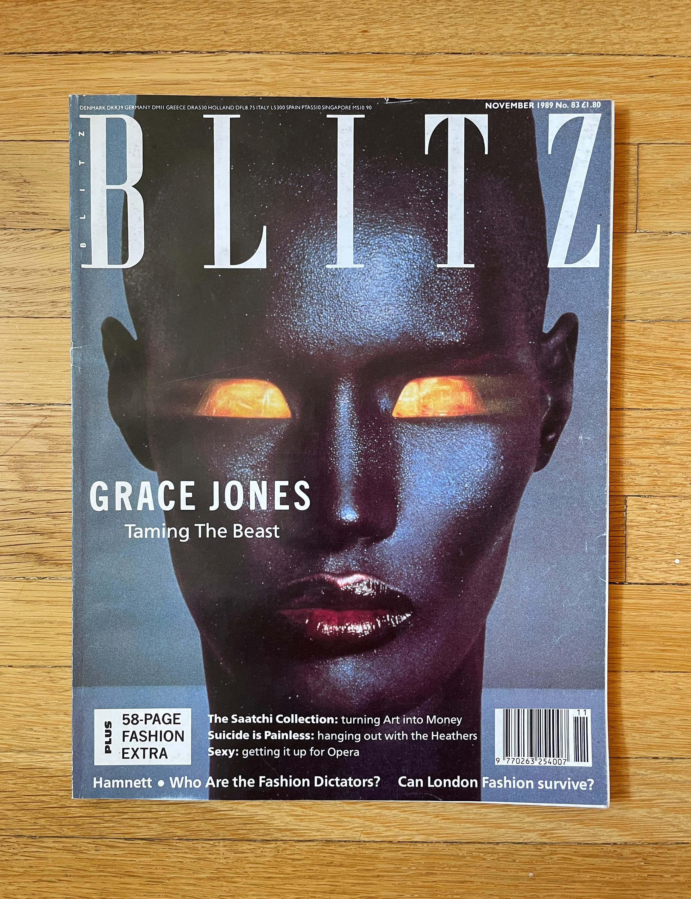
9) Blitz ─ A too-cool-for-you British fashion, entertainment, and lifestyle magazine named after the Blitz Kids of London’s early 80s. Flip through any random issue and you’ll be confronted with an array of names, faces, and looks that had a moment for a few years, but now have zero lasting cultural footprint and have escaped the reductive 21st century re-packaging of 80s style. It’s this forgotten gutter of that decade that I find especially interesting.
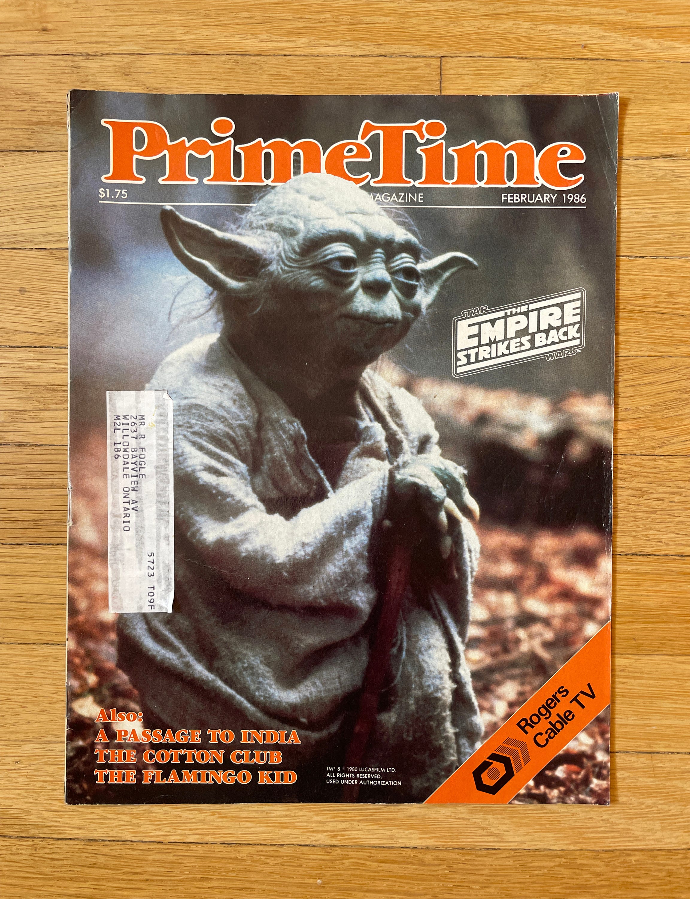
10) PrimeTime ─ This was basically a TV Guide for Canada’s answer to HBO, Superchannel, and it became my gateway to movie obsession as a kid. There was something hyper-organized about the layout, which young me found very compelling. New movies had their own little self-contained info squares with descriptions, photos, cast list, custom graphics, and I used to pour over these in anticipation of their showtimes. On the off-chance that anyone reading this has any issues of PrimeTime circa 1988 to 1993 sitting in their basement, I WILL ABSOLUTELY BUY THEM OFF YOU (@okaywood).
LEARN MORE ABOUT CANNOPY:


